Free shipping on orders over $99* (exclusions apply).
Free shipping on orders over $99* (exclusions apply).
Shop
apparel
Add description, images, menus and links to your mega menu
A column with no settings can be used as a spacer
Link to your collections, sales and even external links
Add up to five columns
Add description, images, menus and links to your mega menu
A column with no settings can be used as a spacer
Link to your collections, sales and even external links
Add up to five columns
Add description, images, menus and links to your mega menu
A column with no settings can be used as a spacer
Link to your collections, sales and even external links
Add up to five columns
Add description, images, menus and links to your mega menu
A column with no settings can be used as a spacer
Link to your collections, sales and even external links
Add up to five columns

BLUE COLLAR BLUEPRINT
September 03, 2023 2 min read
Creating a collection’s custom print is both fun and challenging. It needs to encapsulate the essence of the collection and it also needs to be universally applicable, it has to be versatile enough to work in more than one way.
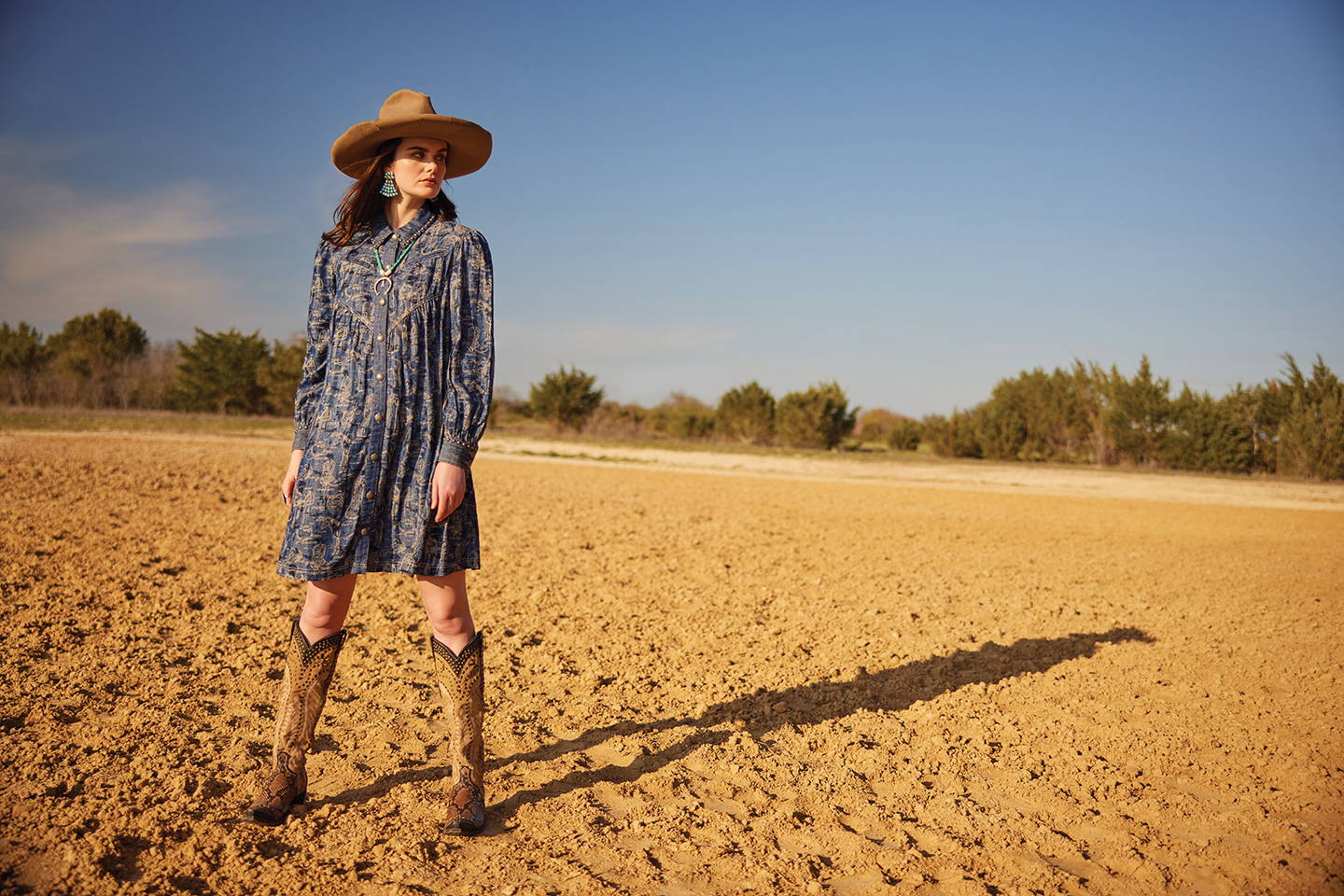
“The concept behind all of Cowpoke U was kind of this tongue-in-cheek ‘university’, right?” Cheryl said. “So, I was in this mindset of academia, of higher ed, of textbooks and study guides and whatnot, so that’s where the seed was sown for Cowboy 101 print. It was going to be more or less a glossary of the basics you would need to know for a crash course in cowboying, a blueprint of the basics. We inverted it, in terms of color, and did the khaki outline images on a classic denim – literal blue on white, like an architectural blueprint, would’ve been a little too on the nose and lost the cowboy element, I think.”
If you’ve looked closely at the print, you can discern the diagrams of ranch hand’s way of life – from the contents of his closet, like a cowboy boot and a cowboy hat, to the essentials in his tack room, like his saddle, his chaps, and his spurs – and of course, his trusty steed. It’s not the twangy, time-worn terminology we learned from Bruce Lee Webb’s “Western Slick Up”, just the nitty-gritty cowpoke basics, hence the rudimentary naming of it, “Cowboy 101”.
“I think a recurring reminder for us when designing it was not to overcomplicate it,” Cheryl explained. “Keep it simple, 2D outlined imagery of the fundamentals, which kept it chic. If we had gone full-color or in-depth, it would’ve gotten busy; and while I have no doubt it could’ve become something beautiful going that route also, this was the introductory vibe we were after. And the cool thing about it is, as complex as the collage is when you really sit and study it, overall at a glance it works as a neutral, just like any distressed denim.”
The other awesome attribute of the signature print is the unexpected elegance of doing it in feminine, almost dainty, silhouettes. But subtly.
“Obviously, Cowpoke U is not an overly feminine collection,” Cheryl said. “It’s nostalgic, reminiscent of school days, and a little more on the rugged side, so we used little hints of it here and there, like the shoulders of the top, how they’re gathered for a little volume, and the same with the dress in addition to the V-ed empire waist. The skirt, it’s full and flowy, with almost a classic broomskirt but it’s really just that one gathered top tier. All in all, I think it balanced the straight-forwardness of the print really well.”
Oh, and in case you missed it, we also styled it into some pretty sweet socks!
Leave a comment
Comments will be approved before showing up.
Recently viewed products
Join Us
Our emails are the prettiest. Dress up your inbox:


