Free shipping on orders over $149* (exclusions apply).
Free shipping on orders over $149* (exclusions apply).
Shop
apparel
Add description, images, menus and links to your mega menu
A column with no settings can be used as a spacer
Link to your collections, sales and even external links
Add up to five columns
Add description, images, menus and links to your mega menu
A column with no settings can be used as a spacer
Link to your collections, sales and even external links
Add up to five columns
Add description, images, menus and links to your mega menu
A column with no settings can be used as a spacer
Link to your collections, sales and even external links
Add up to five columns
Add description, images, menus and links to your mega menu
A column with no settings can be used as a spacer
Link to your collections, sales and even external links
Add up to five columns

BECOMING THE BRAND
July 28, 2024 1 min read 1 Comment
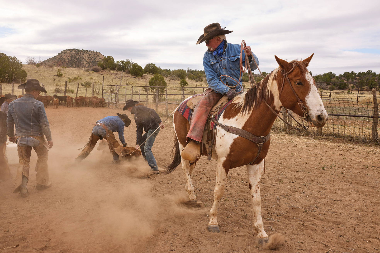
Long before it was a boardroom buzzword, branding meant making your mark in a very literal sense.
Originally referring to the iron-emblazoned emblem staking claim to your livestock, it’s since expanded to encompass a whole spectrum of symbolism, but at its core, your brand still stands for the same thing: your livelihood and your legacy.
Anyone familiar with Double D Ranch knows how dear we hold both of those things, how deeply we revere them and how fiercely we will protect them. (Like a pack of wolves, one might say.) Ironically, in the beginning, we didn’t take our ‘brand’ all that seriously – we didn’t really workshop the name all that much, just stuck with the first thing that came to us, Double D for “Doug & Daughters”, and our logo was about as simple – after all, we thought we were just selling some coats to fund a family ski trip. But, in the three-plus decades since then, we believe our ‘brand’ (in both the literal and the macro sense) has evolved in significance and sophistication, an evolution that’s reflected in our most recent logo reveal: the bold, blocky D-within-a-D. Strength in simplicity. A sleek, singular letter that speaks volumes to those in the know.
1 Response
Leave a comment
Comments will be approved before showing up.
Recently viewed products
Join Us
Our emails are the prettiest. Dress up your inbox:


Diana
August 25, 2024
Oh my, I am in love with this new logo. I’ve always been intrigued by variations on font, blocking etc for my initial. While old world scroll is so elegant, I am definitely more of a simplistic styling with letters. Eagerly awaiting the appearance of this.